MenoRenew is an all natural pre-menopausal supplement made for women, by women.
MenoRenew
VISUAL DIRECTION
LOGO DESIGN
BRAND GUIDELINES
SOCIAL TEMPLATES
The Ask
Since the supplement was being marketed towards affluent women in their mid-to-late 40s, it was crucial to position the product as high-end. This presented a challenge of balancing organic design elements with minimalist elegance to achieve the right tone.
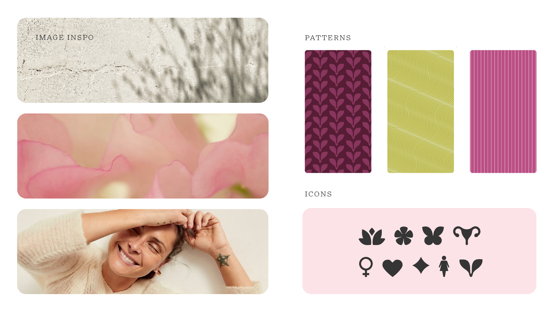
The client had 3 priorities she wanted to visualize in the branding: female empowerment, elegance, and the all natural ingredients.
Logo Design and Visual Directions
Round One


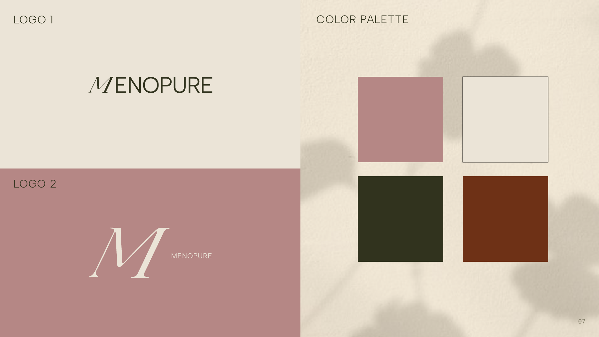


She Chose Direction 2!
The client liked the logo in Direction 2, but felt the ‘M’ could better reflect the brand’s femininity or natural benefits. After exploring trademark options, she chose to rebrand from “MenoPure” to “MenoRenew.”
Round Two
Logo Revisions

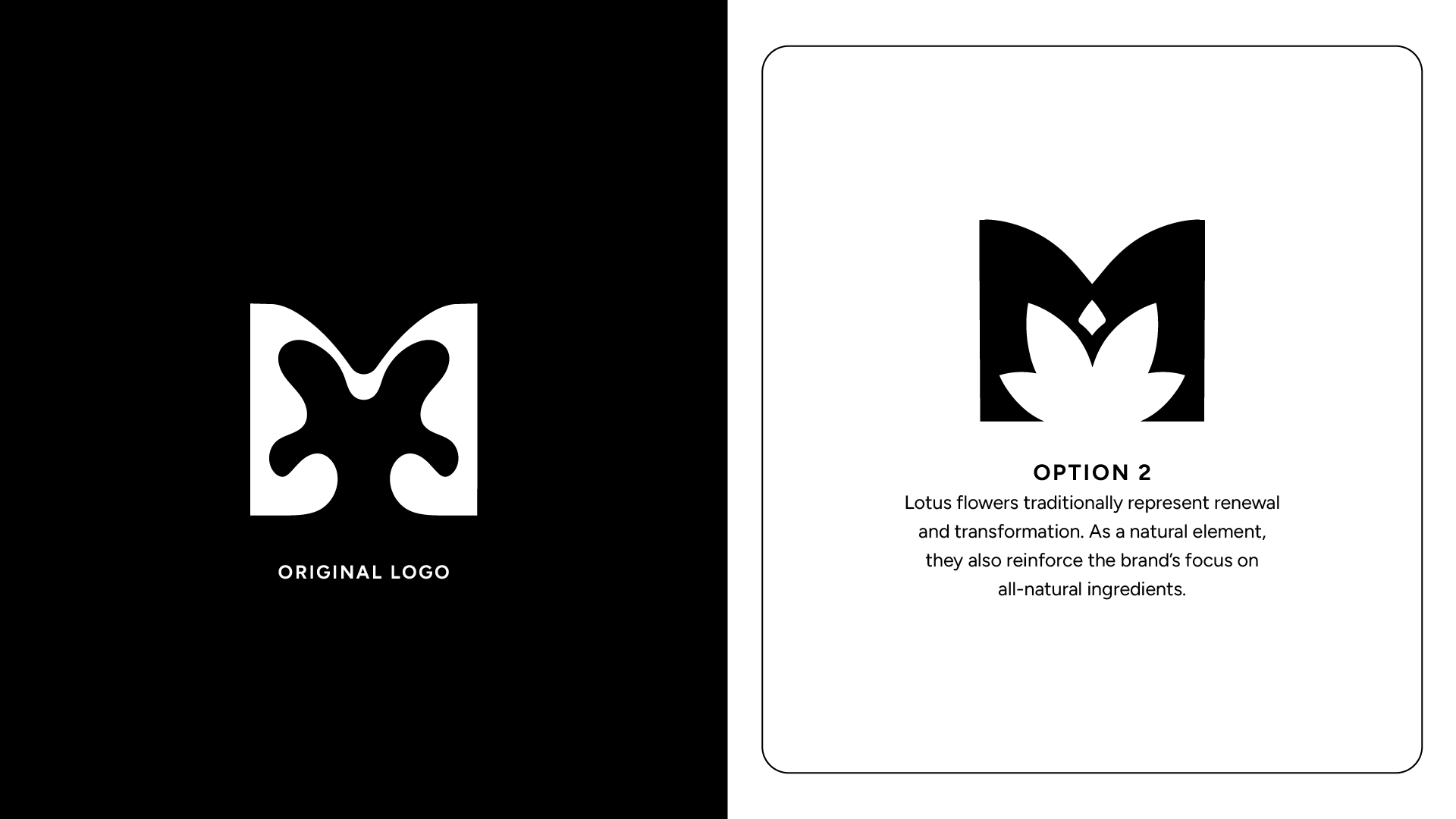
She Chose Option 2!
Next, it was time to start building the other brand assets and social templates.
Logo Suite, Typekit, Color Palette, etc…
Round Three